Wibey

Don't wanna read? Listen my story!!

Wibey is Walmart's internal AI assistant, used across Walmart Global Tech. As it moved into its next version, three designers had already researched one piece of it, the sessions panel and sidebar, and I was brought in to bring that to life. The scope didn't stay there. Once the panel was in motion, it pulled in the rest of the product: Library, Documentation, Settings, Metrics, Catalog, and a brand new concept threaded through all of them, Workspaces.

Role:

UX Designer II

Duration:

1-2 months

Wibey

Don't wanna read? Listen my story!!

Wibey is Walmart's internal AI assistant, used across Walmart Global Tech. As it moved into its next version, three designers had already researched one piece of it, the sessions panel and sidebar, and I was brought in to bring that to life. The scope didn't stay there. Once the panel was in motion, it pulled in the rest of the product: Library, Documentation, Settings, Metrics, Catalog, and a brand new concept threaded through all of them, Workspaces.

Role:

UX Designer II

Duration:

1-2 months

Wibey

Don't wanna read? Listen my story!!

Wibey is Walmart's internal AI assistant, used across Walmart Global Tech. As it moved into its next version, three designers had already researched one piece of it, the sessions panel and sidebar, and I was brought in to bring that to life. The scope didn't stay there. Once the panel was in motion, it pulled in the rest of the product: Library, Documentation, Settings, Metrics, Catalog, and a brand new concept threaded through all of them, Workspaces.

Role:

UX Designer II

Duration:

1-2 months

The Challenge

01

The work existed. The structure didn’t.

Wibey had grown feature by feature, and it showed. This wasn't a fix for one broken flow. The redesign was about making Wibey genuinely good to use: clean, readable, and fast, with new features that let people enjoy the experience and get their work done without friction.

Solutions

02

Chat

Switch conversations without losing your place.

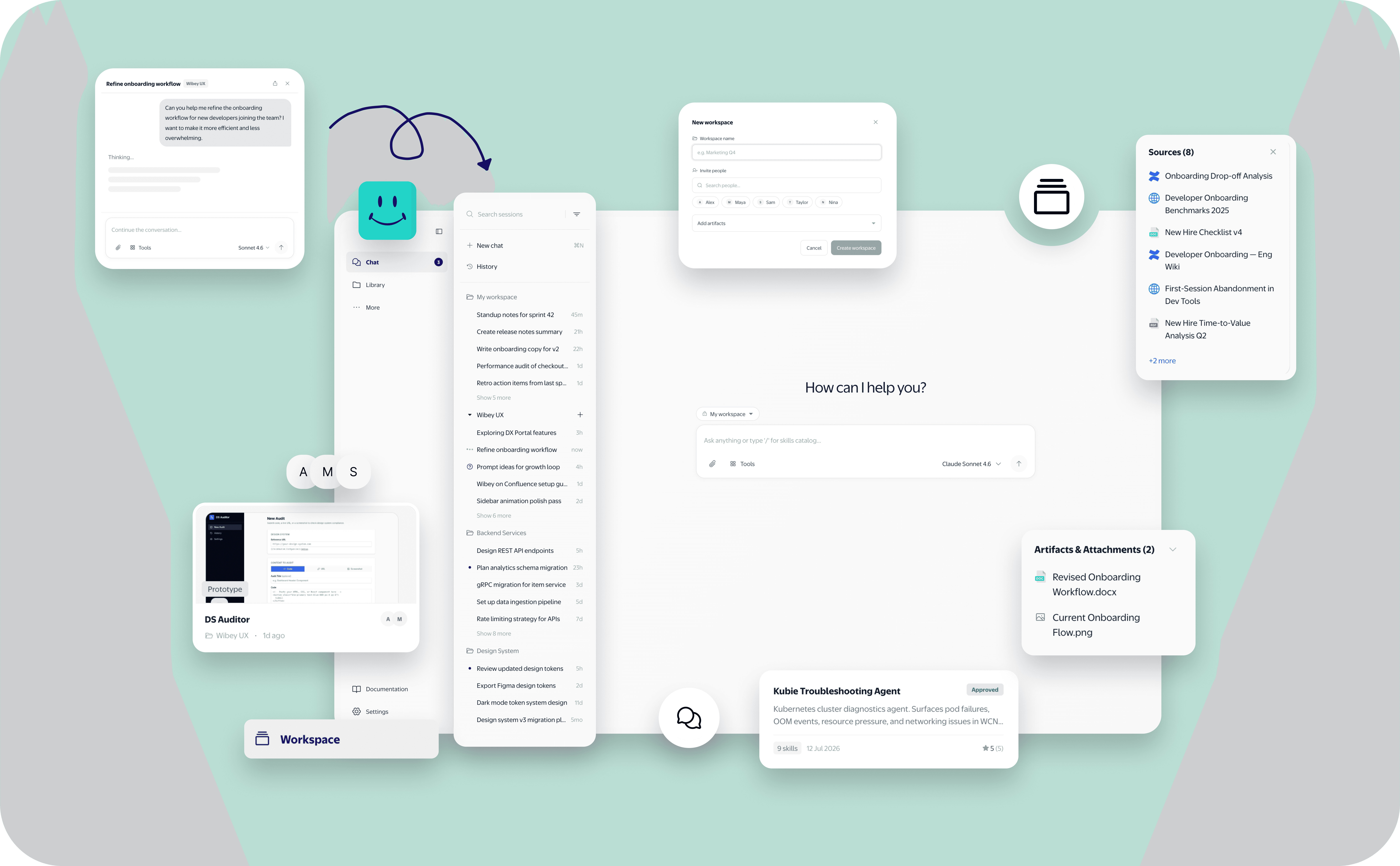
Merged two nav items, New Chat and Sessions, into one, since switching context meant fully leaving the current chat. Opening Chat now surfaces a sessions panel grouped by date or workspace, with a sources card, artefacts card, and timeline built in. Building this into the prototype meant working through how session state persists across the merged view, not just how it looks.

Workspaces

One shared home for the whole team's work.

A new concept: a shared home for a team's conversations, attachments, and artefacts. Built into existing surfaces rather than its own page, chats, Library, and CI/CD are all scoped to a workspace, so it doesn't add another destination to check. Creation and invite flows are still being defined.

Library

Everything you made, minus the clutter.

Attachments and artefacts existed before with no context, you couldn't tell where anything came from. Restructured to trace every item back to its origin, workspace and chat, with better filtering, more context per item, and a stronger visual quality bar than before.

Documentation

Answers, not another link to click.

Info used to be scattered across pages and external links with no single source of truth. Unified it into one page with everything a user needs. Pulled FAQs from real questions asked in page comments, Slack, and Confluence. Added a quick-ask feature, a page-scoped chat, for anything still missing.

Metrics

The same data, finally easy to read.

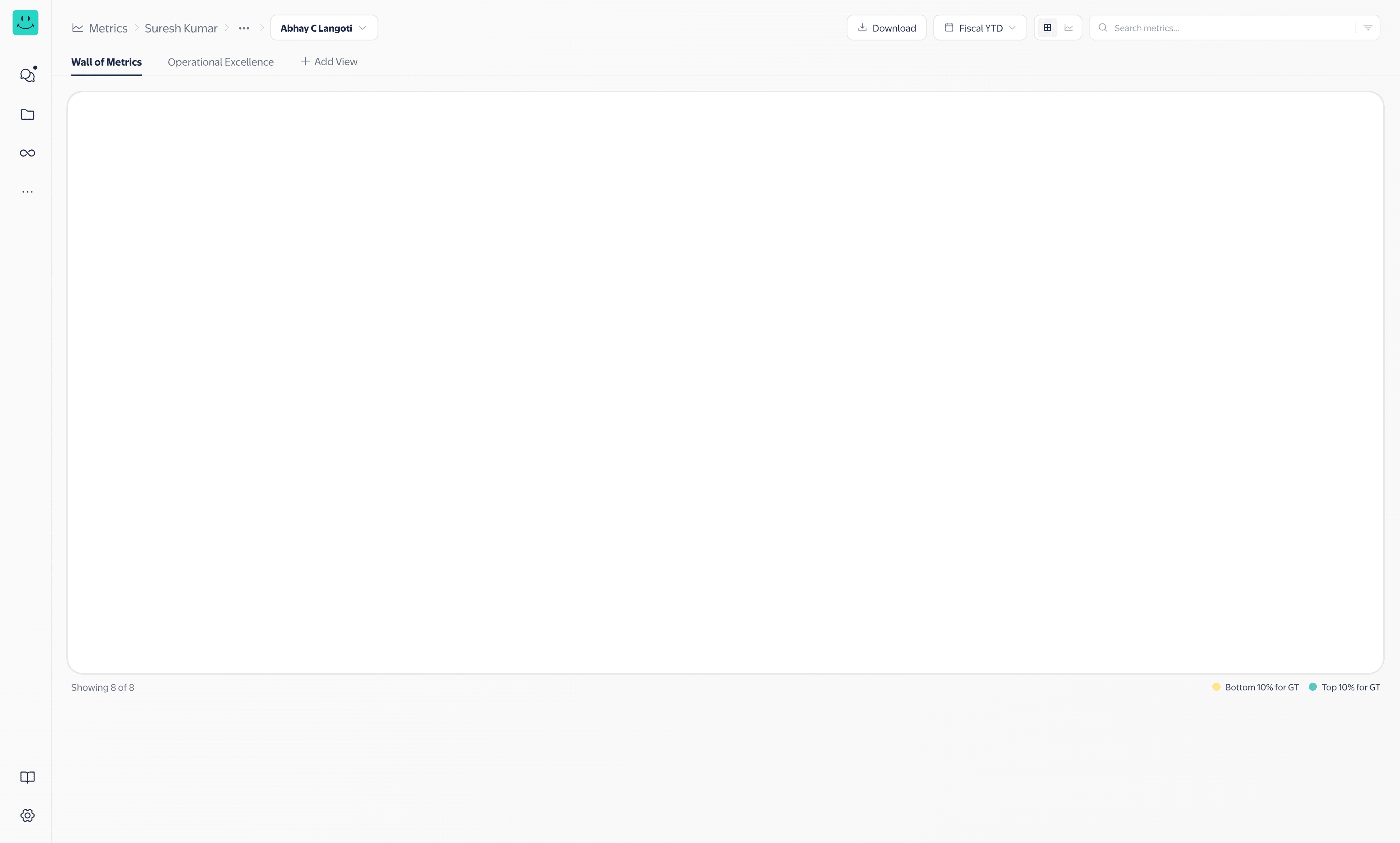
The numbers belonged to other teams, not ours to change. What was ours: how people reach and explore that data. Redesigned filtering, layout, and pathways to related metrics, turning a noisy page into a navigable one.

Catalog

Try before you leave the page.

Was a read-only meta-registry pointing to a separate platform, users could look but never act. Rebuilt inside Wibey as fully interactive: try an artefact, duplicate it, or adopt it as-is, because passive discovery wasn't enough.

Create

Build together, without leaving Wibey.

Creating an artefact meant leaving for Studio, with no way to collaborate. Brought creation into Wibey and paired it with Workspaces, so teams build together in real time instead of across disconnected tools.

Quick Chat

A chat window that follows you, not the other way around.

Conversations felt locked to one screen. Hovering the sidebar chat icon now opens recent chats and a new chat button from anywhere, launching a floating window you can resize, drag, and dock.

How It Came Together

Rather than stopping at static screens, we vibe coded all of this into a working prototype: functional, clickable, close to real behaviour instead of just a picture of it. That made it much easier for product, engineering, and design to actually collaborate. Engineering could see how something behaved instead of guessing from a mockup, and design decisions could be tested and argued over in something that felt real, not just implied.

Impact

03

Why this matters.

Faster switching.

Fewer clicks to switch conversations or trace a source


Shared workspaces.

Teams build together in one shared workspaces

instead of scattered tools.

One tool, not three

No more leaving Wibey to create in Studio or browse the Catalog elsewhere.

Fewer repeat questions.

Ask Wibey and FAQs from real threads answer things before they're asked twice.

Cleaner pages.

Library, Settings, and Metrics are faster to scan and easier to use.

Chat, anywhere.

Chats are reachable from anywhere, without breaking your flow.

Reflection

04

What I’d take forward.

This project taught me to work with a scope that keeps moving. I joined to help with the sessions panel and sidebar, and ended up shaping Library, Documentation, Settings, Metrics, and Catalog too. It also meant designing around constraints I didn't control, like Metrics, where only the experience around the data was mine to shape. Vibe coding the prototype turned a lot of "I think this could work" conversations into "let's just try it" ones, a habit I want to keep.